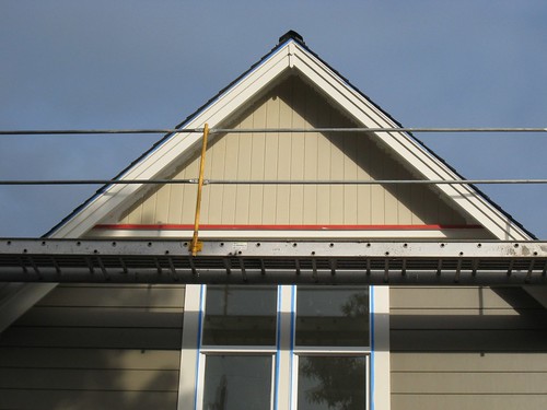
They put on the first coat of the gable end color and accent stripe and I went over to "approve" and I love it. Subtle, with just a little punch. I just happened to pull up right in front, so the mini was in the first shot. Our friend Evan, who was helping us out with the painting, pointed out that the trim matched the mini...sure enough when I put the paint chip on the car it was a perfect match.
Now we just need one more sunny, dry week to finish up the painting....
Wednesday, September 30, 2009
Tuesday, September 29, 2009
flooring installed!
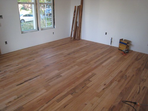
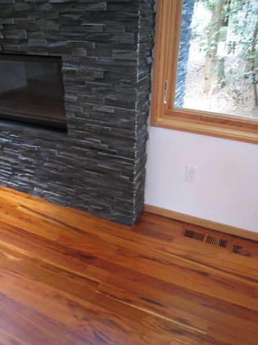
I stopped by the site on my way into work yesterday to see the hardwood floors. Wow! I'm so glad we went with the Tigerwood. It looks so good. We thought about bamboo (would have been $500 less)...looked at walnut (too expensive for us), but I really liked the look of the Tigerwood and I'm glad we stuck with it.
Over time it will darken and look more like this:
Monday, September 28, 2009
bathroom inspiration - sinks
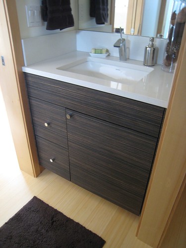
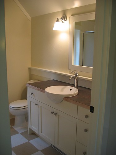
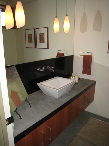
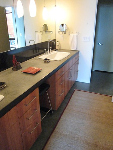
On Sundays, Neil and I like to go to AIA or BuiltGreen open houses. It's a great way to see details up close and be inspired. We have 3 bathroom sinks to choose - one will be a pedestal and the other 2 either a vessel or drop-in. I love this cabinet and simple white counter with undermount...and check out the faucet.
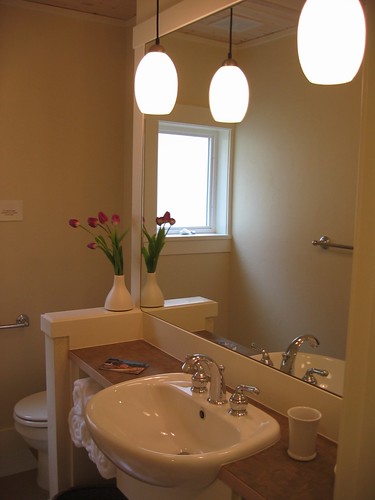
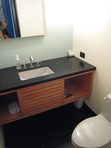
This is a bathroom at one of my projects with Ross Chapin Architects. It is a Caroma and what is great about it is it only needed about 10" of counter.
This one is also a Caroma and a contender for the 2nd upstairs bathroom. We have used it in many of our development homes at RCA.
Recently I had the opportunity of going on a 6 house tour of architect designed homes in Seattle. These were homes I would not normally be able to see. They all had clean modern detailing and lots of inspiration.
Sunday, September 27, 2009
Geoff Prentiss' home
I do love seeing architect's own homes...especially one so crafted and thoughtful as this one in The Seattle Times, Pacific Magazine today. Our homes are always a work in progress and continually evolving.
Photo by Benjamin Benschneider/Special to the Seattle Times
Friday, September 25, 2009
bathroom tile
We are still designing the tile layout in the bathrooms. Even though the house is only 1600 sqft, it has 3 bathrooms. We went to http://www.seattletile.com/ for our first round and Denee Foti, the owner, was extremely helpful. There are so many options it is a bit overwhelming. We wanted something classic, clean, and modern but not too trendy. We are leaning towards the 2 below for the 2 secondary bathrooms and not sure yet on the master. The large grey tile would be the floor with the white subway on the walls with an accent band.
accent color choice
Subscribe to:
Posts (Atom)