Saturday, February 27, 2010
sunday open house 12-4pm
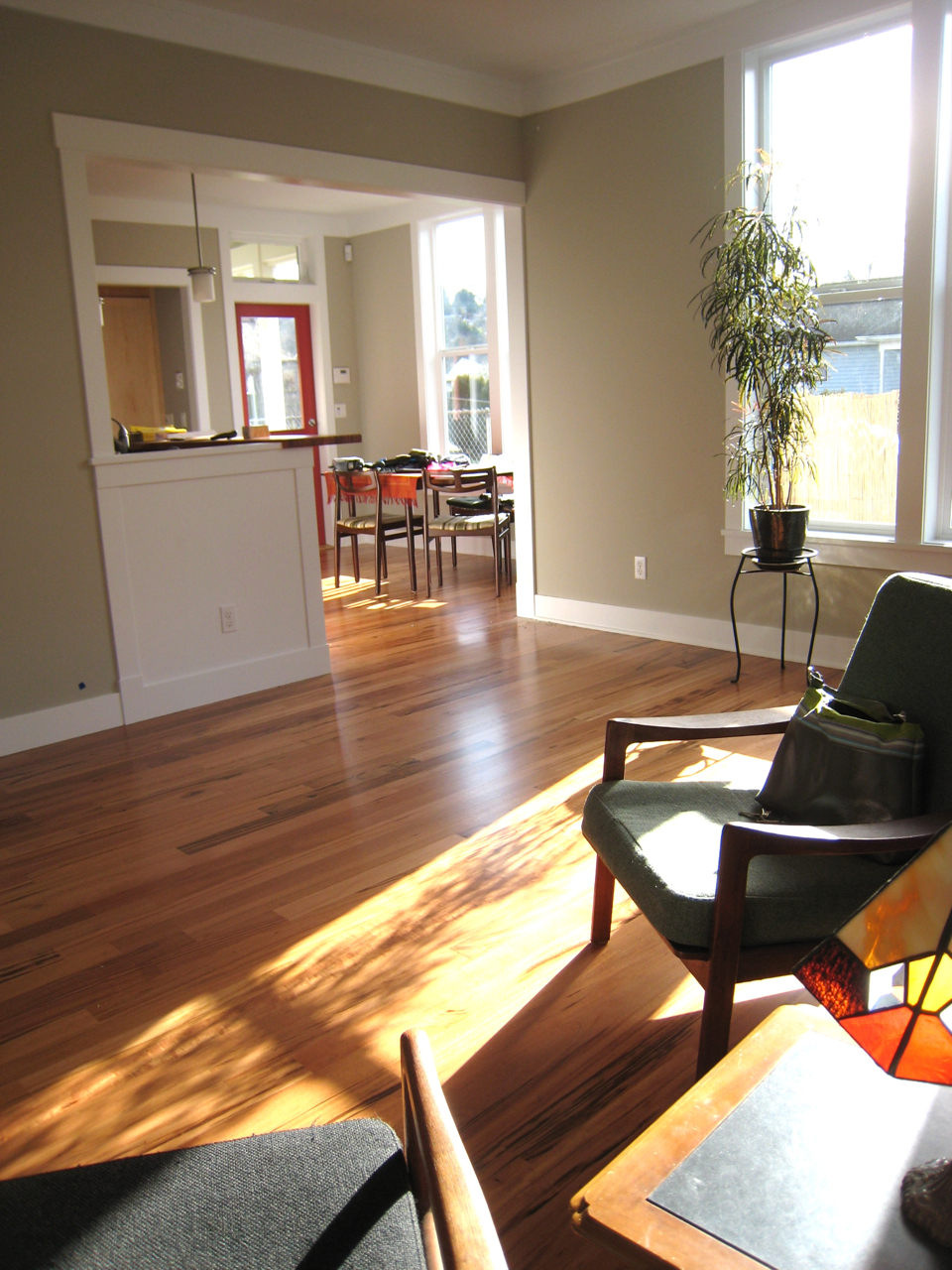
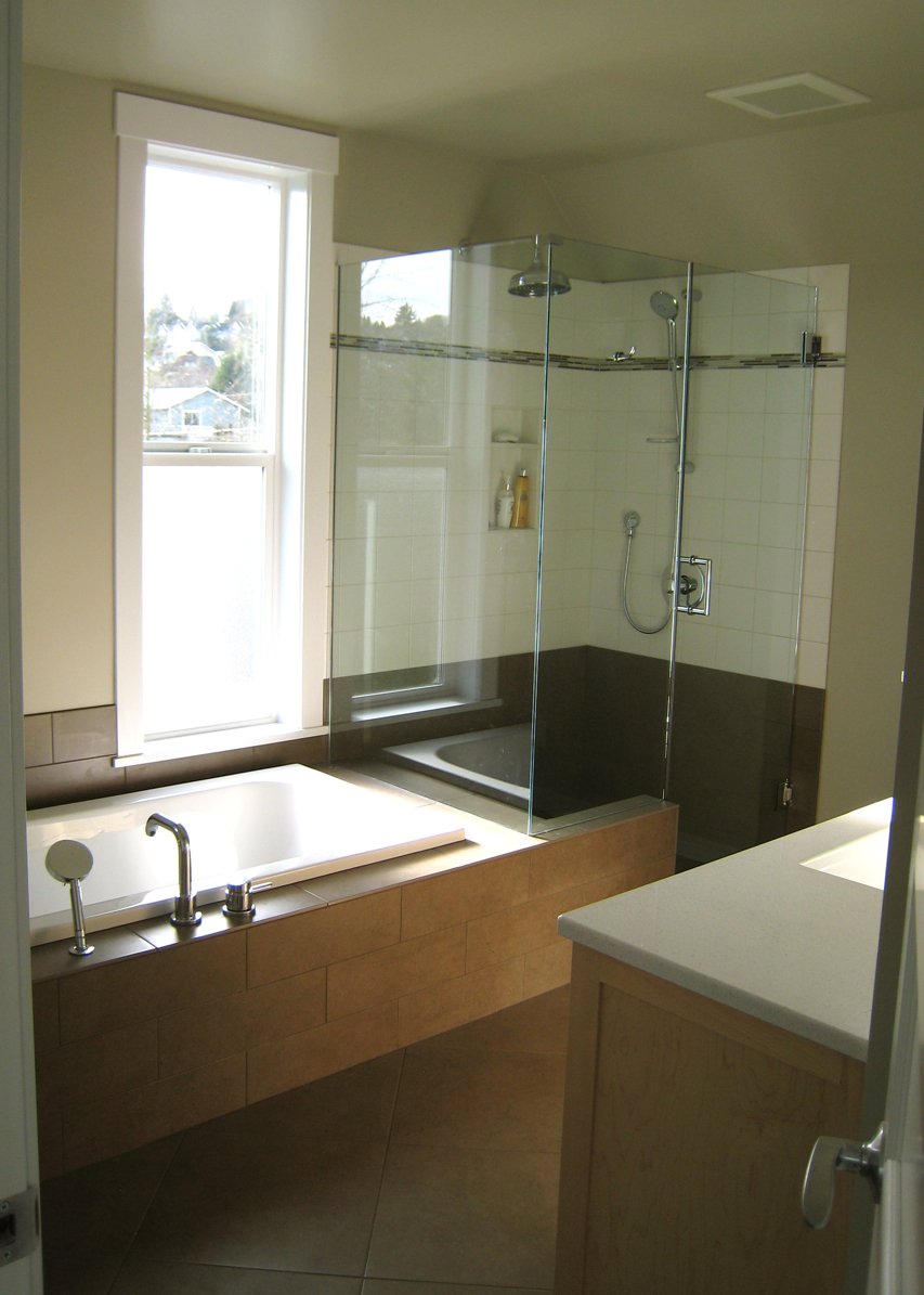
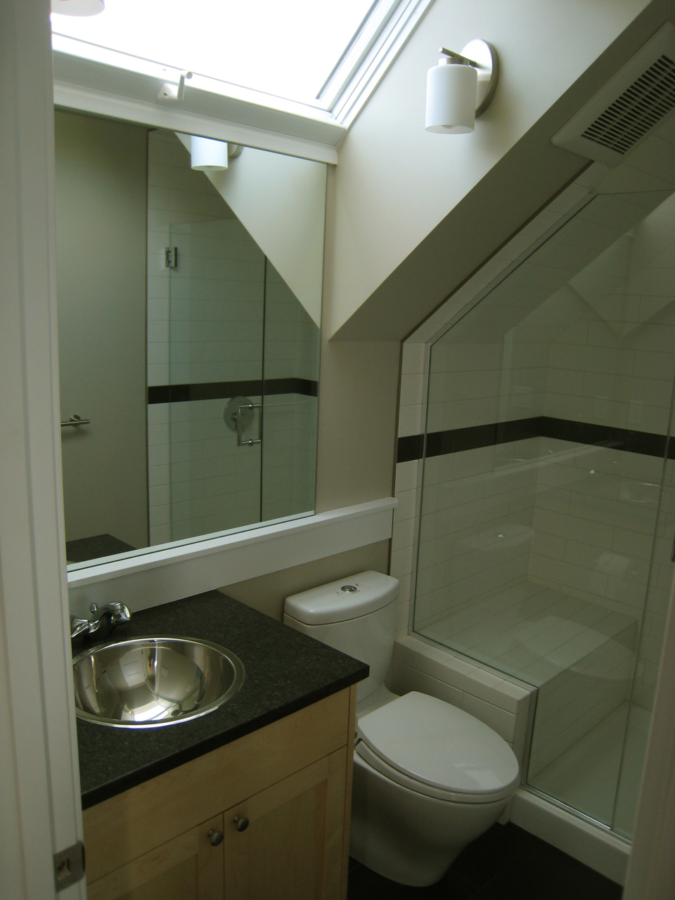
We are having an open house every Sunday in March, so if you are in the area, stop by and see the house in person.
Tuesday, February 23, 2010
selling
I love night shots. I really need to use a tripod, but these didn't turn out too bad. I was taking a ton of photos throughout the day yesterday in different light, trying to get 15 to use to market the house. We are putting it up for sale at the end of the week...for many reasons, but the main being simply financial. It's been a long year and we have really enjoyed creating the house. Even though we would be happy living in it longer, we hope to find someone who will love it just as much.
Monday, February 22, 2010
soaking up the sun
We had a big push on the landscaping at the end of last week through the weekend. To deal with the grade change at the front, we had Matt Collins and his crew of Weigh Bones put in a rock wall. They also put in a gravel path from the front to the back patio and they put in the patio.
There were about a dozen large rocks left over, so on Saturday I placed them around the patio to help with the grade change there. We only wanted 2 risers from the back deck down to the patio, so they had to build the area up with gravel. Originally we were going to put a step, but after using it this weekend when friends were over, we liked how it created seating.
We had a few friends over to celebrate the completion of the house and before we put it on the market. What a beautiful day it was! The south facing back deck and patio worked just how I had envisioned it and many of us ended up gathering there to soak up the sun. Inside, the house was filled with light and the raised counter in the kitchen was perfect for the buffet of cinnamon buns.
It was fun to have kids running around, exploring and finding their own spots to sit.
Thursday, February 18, 2010
built green - blower door test
We have been building the house to a 4 star Built Green level. Built Green is our local Master Builders Association, green building program. Building to this level exceeds current building and energy codes and to qualify at this level we needed to use a 3rd party to verify our points. Today, Chris of O'Brien & Company came to verify a bunch of our items and do the blower door test. This tests the air tightness of the house and can help locate any air leaks coming. The house is depressurized with a fan in the door and a rating is taken. We had taken steps prior to this, to seal the house as best we could. Mainly Neil and crew went around and caulked along the exterior plates, wall intersections and sealed the electrical outlets, but I think it was his tight framing and care throughout the building process. We not only met the lowest Built Green rating but surpassed that by half as much. Basically we aced this test. What that means is that we have more control on how fresh air enters the building. We have fresh air vents in the windows of the living room, dining room and bedrooms. What we don't want is air being pulled in by the ventilation fans from the attic space, walls or crawl space.
Wednesday, February 17, 2010
brixton builders - seattle kitchen remodels
I've been wanting to put some pictures up of some of Neil's past projects. It's always fun to see some before and after shots...but he's not always so good at taking the befores. Neil has 23 years of experience in residential building, most of which has been remodeling. He started his own company, Brixton Builders, 13 years ago. Below is the before of the above photo.
Below was an extensive remodel/restoration of a 1903 Capitol Hill house. The photo below it, is the before.
Much of Neil's work comes from referrals or repeat clients as was this kitchen below.
All of these are in the Seattle area. There is so much great housing stock in Seattle, that remodels are very common...especially those 30's and 40's size kitchens. Being able to update the appliances, cabinets, counters, paint and kitchen layout...maybe even increase the size and redesign, brings new vibrancy to home.
Sunday, February 14, 2010
seattle flower show
Wow...not sure where that week went. Sorry that I've been quiet. We are still working on the yard and choosing plants. Seattle's flower and garden show was a little over a week ago and I was able to sit down with a landscape architect for a 15 minute consultation. It was very helpful and pointed me in a good direction. There was much there to be inspired by. So many wonderful textures and pairings.
Above is Nandina domestica "Moyers Red", which we are considering for the south side. Love the color and lightness of this shrub. It's also drought tolerant and suitable for our clay soil. Even though we have amended it, there's still clay 12" down.
Above is a Barberry - Berberis x gladwynensis "William Penn".
This is another source that I've been using - GREAT PLANT PICKS.
Sunday, February 7, 2010
cabinets as stairs
A friend of mine recently bought her first home, a loft space in a converted school building. The only access up to the loft, though, was a ladder. Her poor kitty could not climb it and it was just not convenient for everyday use. She asked my opinion on a stair kit, something similar to a spiral stair. Honestly, I didn't like it and sent her a picture of a bookcase stair I had seen and said if she was interested, I could draw up something of more use and much better looking then the stair kit. This is what we came up with. Our friend Jeff Fernald constructed them and Michelle picked out the door handles and designer switch plate. Needless to say, Lou the cat is much happier with this design, as is Michelle. It's fun to do small projects like this. Much of design is just solving a problem in a creative, useful and pleasing way.
Thursday, February 4, 2010
rug choices
Sometimes it is just to hard to visualize something in my head, especially when there is so much else going on in there. Photoshop is definitely a great tool to help with this and make decisions. I've shown a few examples on this blog at how I use it. Right now it's coming in handy with rug colors. Do we go off-white, dark gray, black or brown? We are moving our couch over soon and putting a new gray cover on it. It will be a couple shades lighter than the chair - kind of like the mid tone of the blanket. Is that too much gray? I do like the darker shades. Dark for a floor is my preference. We have a light blue carpet in our current home and it shows all the fuzz of 2 cats.
Wednesday, February 3, 2010
it's all about the light
Good morning! What a beautiful day we had yesterday. The light was just streaming in the windows and filled the house. It was hard not to walk around with a huge smile on my face. The character of this house is traditional but the amount of light that comes in, makes it stand out from older homes. (well that and it's energy efficiency.)
Siting the long side of the house to face south was the first step in bringing the light in. I chose to modify this plan (originally the GoodFit Kaleah) because of how much it opened up this way with the tall windows facing south. In our gray Seattle weather one needs to bring in as much light as possible.
This counter was a remnant from our tiler. Supposedly it is a very expensive slab...I need to find out the name of it, because it's beautiful. Love all the texture in it.
We looked at the numbers here and out on the post. I liked them under the light and going horizontally versus vertically.
Monday, February 1, 2010
books
Ahh...some books are in. It's amazing how they transform a room. They look so good on Neil's clean, white, straight shelves. They make the best decoration! It was fun to unpack them and put them up...it was hard not to start flipping through the ones I had forgotten about or start reading ones I haven't read yet. Many brought back memories either of the book or the time I read it. Nancy Pearl was on NPR before Christmas and mentioned a book that I had to go straight out and buy (locally at Peter Miller Books). Unpacking My Library: Architects and Their Books. If ever a book was designed with me in mind that was it. It inspired me to take these photos of my shelves before I moved.
I'm not someone who organizes my books, besides by size. I like the genres mixed up. More chance for spontaneous finds when I'm looking for something.
Subscribe to:
Posts (Atom)