Thursday, December 31, 2009
happy new year!
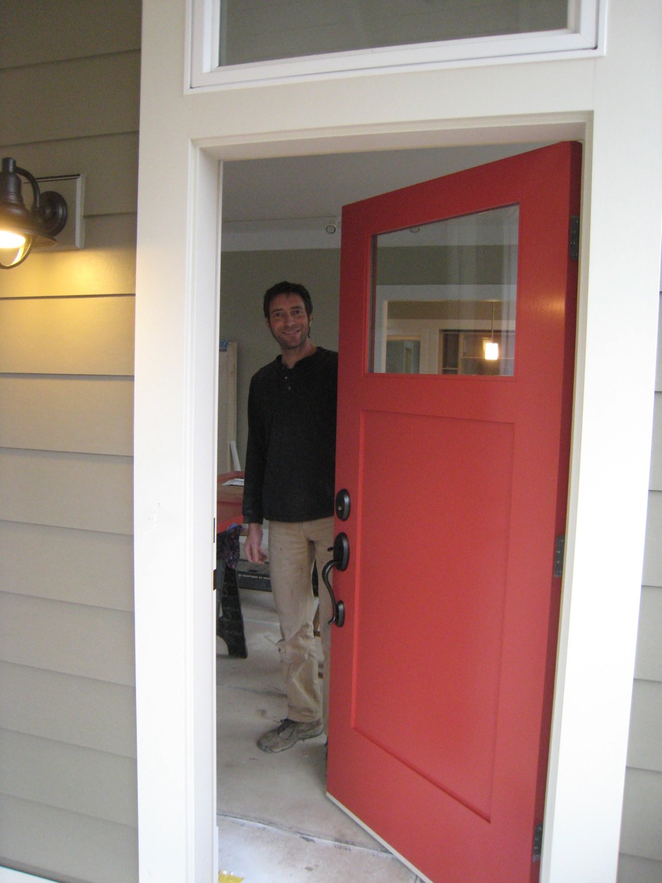
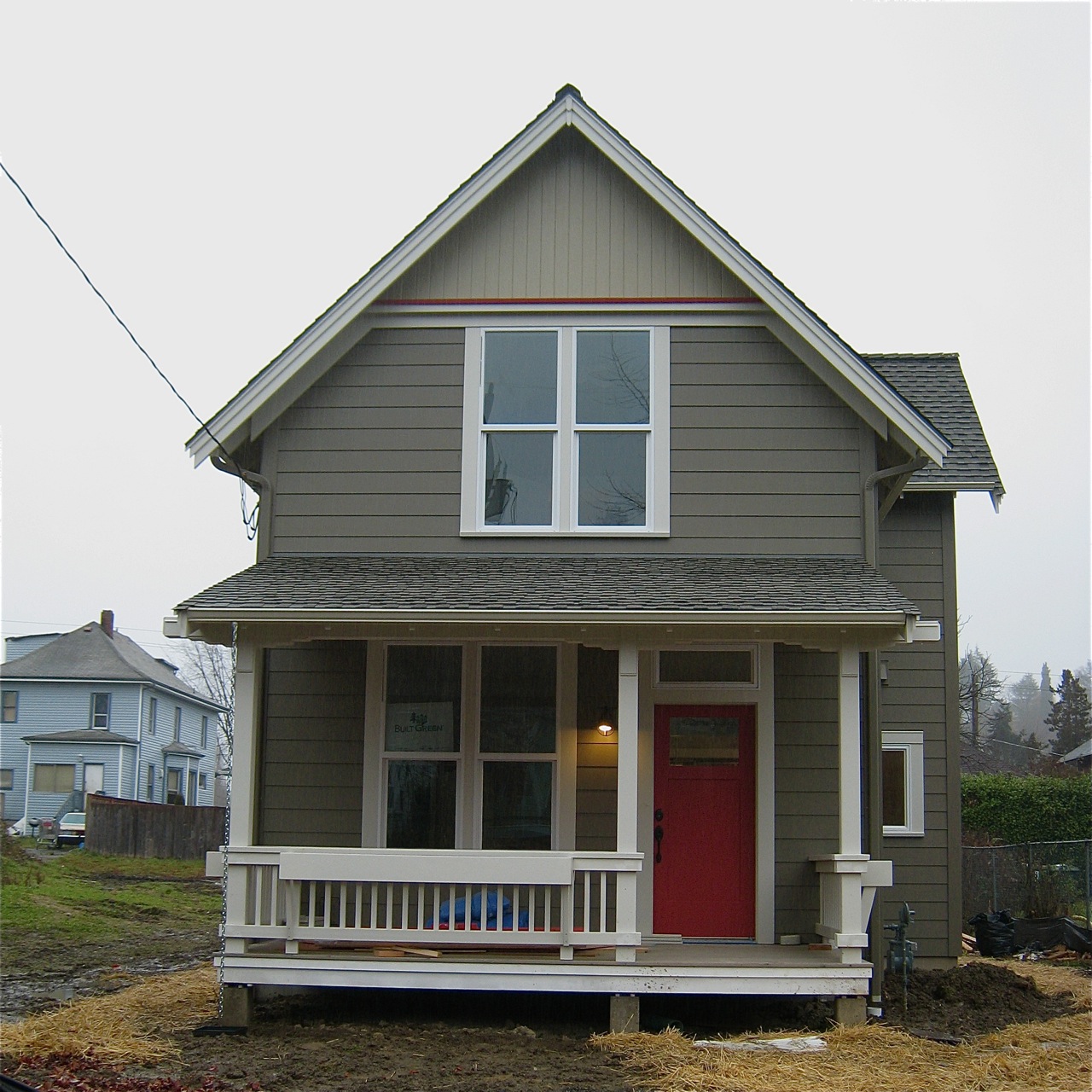
Yeah!! Our front door is up! I love it. Love the color. So glad we went with the red...and there is Neil to welcome me home! I just picked out the door hardware yesterday at Builders Hardware. It's a great place to see a variety of door and cabinet hardware, but also every other kind of hardware piece that goes in a home. I also picked up 2 doorbells, door stops and pocket door pulls. The front door handle is Schlage - Wakefield with a Merano indoor lever handle We switched to the oil rubbed bronze for the front door to match the light fixture we FINALLY decided on. Just have to install the doorbell and the front porch is done. The front door is made by Simpson and is "Craftsman One Panel #6811".
I didn't even notice the flower boxes til I was leaving. They put those up earlier this week. Now I just have to plant them!
Thursday, December 24, 2009
merry christmas
Wednesday, December 23, 2009
ceiling fans & ventilation
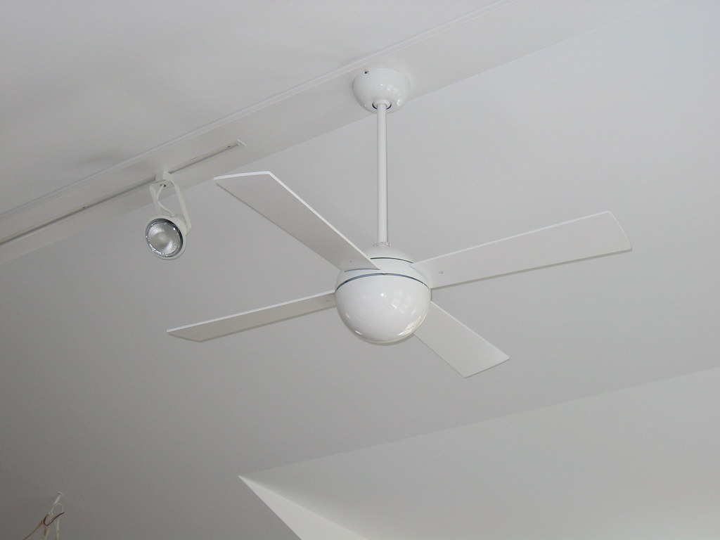
Last night I finally ordered the ceiling fans. I kept hoping to come across some modern good-looking, more inexpensive ones, but should have just ordered these from the get-go. We currently have this model in our home. Not only is it simple and clean looking, it's quiet. They are also Energy Star rated. I ordered 3. 2 with a stem as shown above and one "hugger" like below all from Ylighting.com - a good source for modern lighting.
The ones with stems are going in the upstairs bedrooms and the "hugger" is going in the stairwell. That one in particular will help circulate the air throughout the house. In the winter we reverse the rotation which helps keep the warm air down off the ceiling. In the summer in Seattle we are lucky enough to typically not need air conditioning. We have 4 operable skylights throughout the house to help naturally ventilate and cool in the summer time. We also put in operable transom windows above the first floor doors, so that they could be left open at night and not pose a security risk or a cat escape.
Monday, December 21, 2009
The Karina - busy weeks
Here is Alec prepping the side door for sanding then paint. Neil slapped up some paint on the temporary front door, so we could see what the red would look like. The red goes with the red trim in the gable. If you paint the exterior door red, to me, you have to paint the inside red...it's one unit, one mass. It would be odd to have it half and half...but it is bold. I actually like it and the thing about paint...one can always paint it another color. We talked about oiling it, since it is fir, but nothing else has been left natural on the exterior and well...the red works.
There is a lot going on at the house these days. Cabinets are in process and Neil started putting in the toilets over the weekend as well. The electrician starts today installing all the outlets, switches and what light fixtures we have. I have a few more to buy, which I'm planning to do this afternoon.
Last week I went and bought some straw to put down around the house. During the cold front we had, Neil had dug up the yard to install the downspout drains. What was once frozen, is now a muddy mess...walking on the straw helps to not sink into the mud.
We originally were going to take the rain water to the street, but decided on digging dry wells instead. There are 2 4'x4'x4' rock filled wells in the front yard for storm water. The site naturally drains towards the front anyway...now we just have to bring in some top soil and start landscaping.
Thursday, December 17, 2009
one of those not so good days
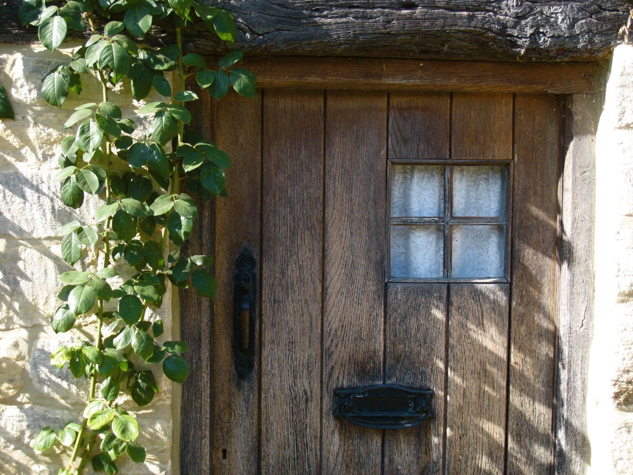
cotswold house in Bibury, England
Some days are more challenging than others to keep "it" together. Yesterday was one of those days. The cabinets arrived and for the most part are great cabinets-very well constructed...except the doors are pink. The light stain we asked for on the maple to help keep it looking like fresh maple (maple will darken over time...especially if exposed to sun) seemed to have a pink tint to it. Not at all what we were expecting. But we are working with the cabinet maker and I'm sure it will all work out and be fixed...it's just hard to explain that to my stomach. Luckily the doors and drawers can be removed and the boxes can be installed...this is critical, because we need the cabinets in place before we can order the countertops which take 2 weeks to be fabricated once they measure. Everything now is dependent on something else being finished ahead of it...lots of coordination being done.
genesee home
The Karina is not the first project that Neil and I have worked on together. The home we currently live in was the first and was completed in 2006...before we were married. The project was to design and construct a garage with an Accessory Dwelling Unit (ADU) above it, or "mother-in-law" apartment. This was before the now allowed Detached ADU, so it had to be "attached" to the existing 800 sqft, 1930's house. I designed it so that eventually the older house could be demolished and the garage/apartment could stand alone. Our property is skinny...only 30' wide by 100' and it's on a busy street. We actually didn't max out the current lot coverage at the time, but we came close to it. Our neighbors property is about 4' or so higher than ours, so we were not concerned with blocking sunlight. My main concern was balancing Neil's wants of a large garage (lots of tools, motorcycles, work area) and maximizing the apartment size with addressing the street and wanting to bring down the scale of the addition. The new addition would be where Neil lived and he ended up renting out the older house for a couple years...until I moved in in 2008. Now my stuff lives in the older place and our day to day living is in the 500 sqft apartment.
Both Neil and I wanted to paint the house grey. Even in our grey Seattle weather, I love this shade. It's rich, yet isn't stand-outish. I really wanted the new house to fit into our surroundings. We originally thought we would use yellow as an accent, but doing these photoshop mock-ups, we realized we wanted something more subtle.
Wednesday, December 16, 2009
The Karina - big day
The cabinets arrive today! I can't wait to see them. The painters finally finished and this is the upstairs front bedroom. The color is the same that we have used in our current home - there's enough contrast, but it's a nice neutral color. Great to bring in accents with furniture and fabric. I'm heading over there later today so will take more photos of the rooms and cabinets and will post the specific wall and trim color tomorrow.
genesee home - exterior details
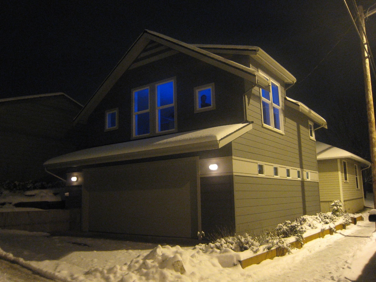
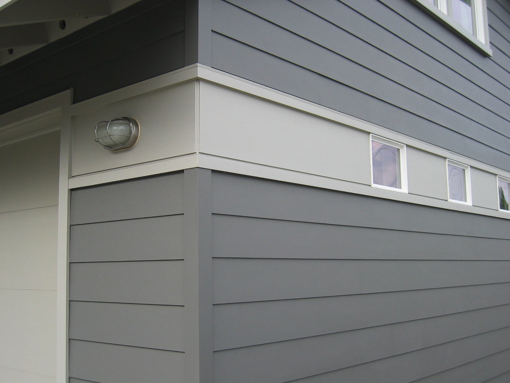
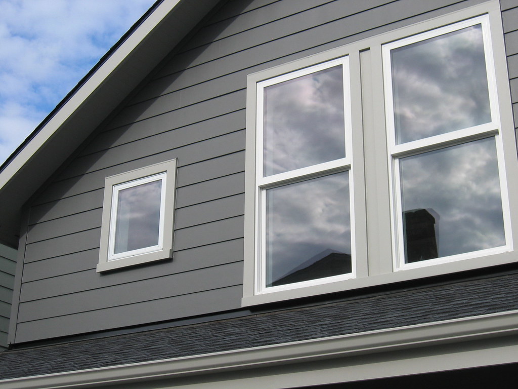
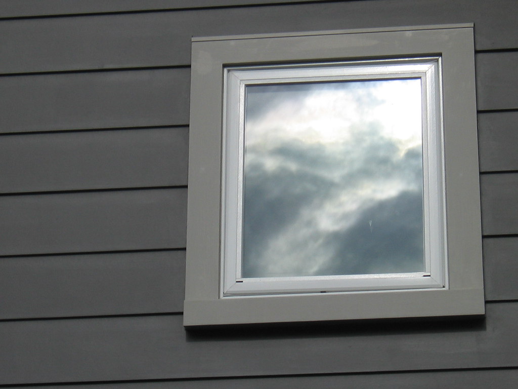
I do love how the house glows at night. The blue light is from our neon coffee table. This picture was taken last year when we had a crazy week of snow. The lower roof over the garage door helps to bring down the scale of such a tall and wide gable and actually was somewhat code driven. Where the facade of the upper story starts is also the plane of where the rear yard begins. We were not allowed to have anything over 12' in the rear yard. The band of windows on the south allows enough light to come into the garage but small enough not to be a security risk. Even though the form is classic we tried to bring in some modern detailing. The window trim is 2x4 picture framed with a 4x4 window sill. We wanted the windows to pop and have a heavy shadow line.
Tuesday, December 15, 2009
our current home - exterior details
The siding is HardiPlank and we used an 8" exposure. I also think this helps to bring the scale down, plus I just like the large exposure...I would have actually preferred more like 10" or 12", but this works. At the top of the gable end we alternated 2x material with the siding and then painted it the lighter grey. This helped to give it some character and balance. Without it, the gable felt too high and looked like it needed something. We originally thought of cross ties or brackets, but wanted a more modern look. The reason why we didn't just have higher windows, was we used scissor trusses on the inside and the windows are proportional to the inside.
Eventually when the older house is removed, I envisioned an entry porch further back off the sidewalk, but for now, we enter in the garage. Our friend Andy did all the metal work throughout the house including the roof overhang here.
Because we have a bus stop right out this door, our stoop gets quite a bit of use. You'd think we would be able to keep up with such a small garden (3'x30'), but this summer we really neglected it due to the new house...luckily many of the plants are drought tolerant. Next spring I'll fill in with more lavender, which is pretty hardy.
Saturday, December 12, 2009
genesee home - inside
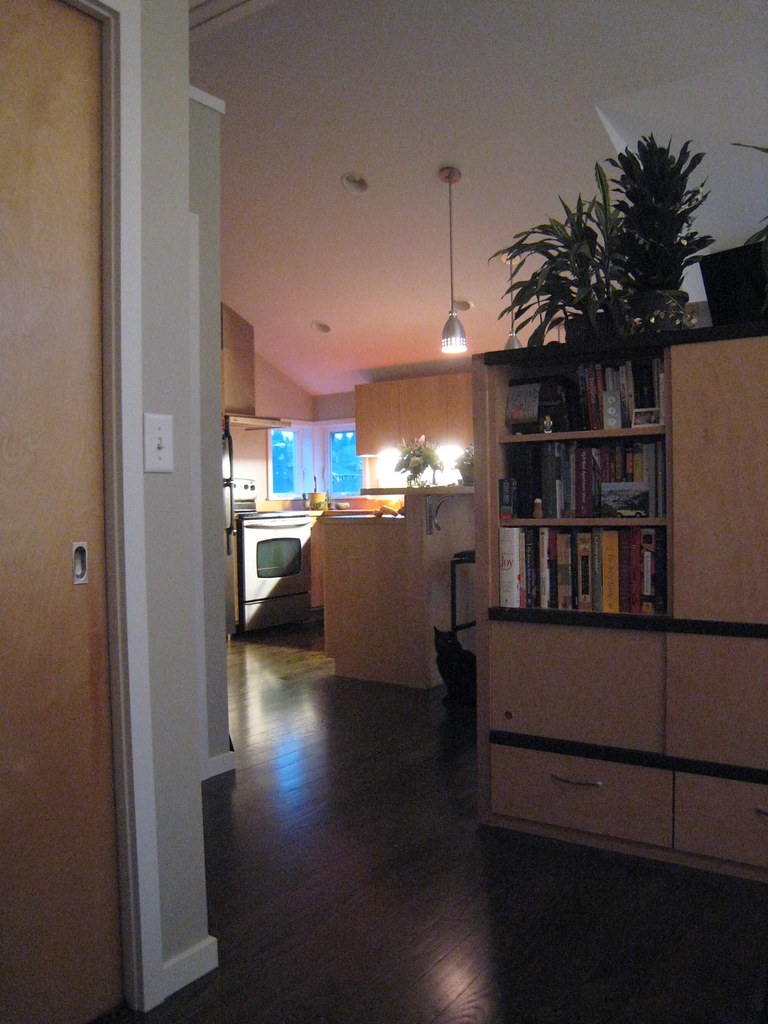
So inside we go...the apartment is about 544 sqft including the stairs up. It's basically a square open plan. There are many aspects that I love about our home, but if I had to pick my favorite, it would be the light. We have windows on all 4 sides with the largest facing South and West. Sitting on our couch, I can look out the window and feel the sun on my face as I read a book or browse on my laptop. The cats also like it up here. Neil created a passageway into the adjoining house and even though all my books, most of my clothes and other items are there, I would say 95% of our time is in the light filled apartment.
The neon coffee table was made by our good friend Marc Lawrence. I commissioned it for Neil a few Christmas' ago, specifically for here. The orange cubes were ordered from Crate & Barrel and are favored by Chessie. The couch pillows were made by me and the rug is FLOR tiles. The orange side table the plant sits on, Neil also made years ago. There is a matching one in the bedroom.
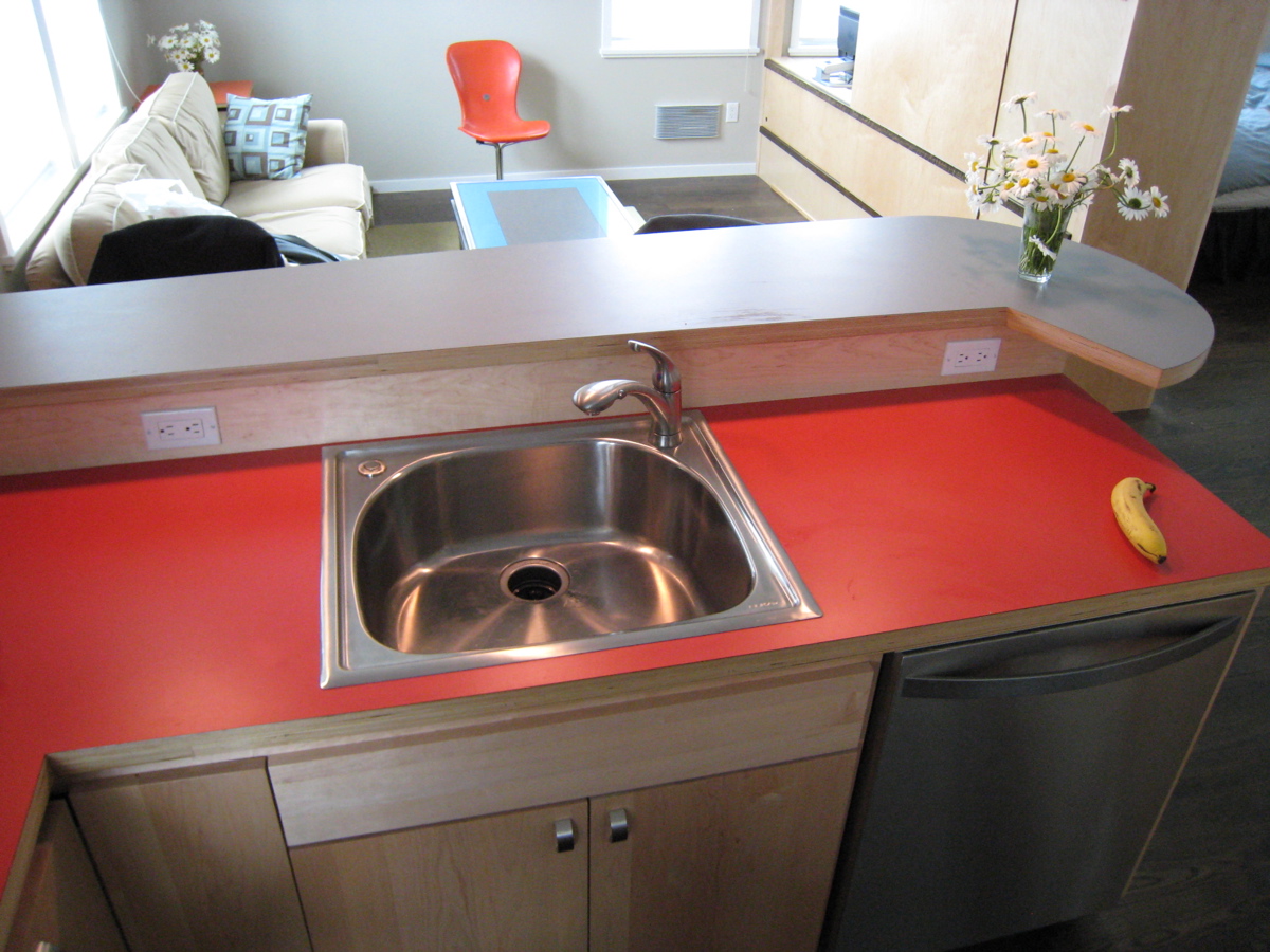
The center cabinet was also built by Neil. We designed it as a multiple use divider between the living room and bedroom. The kitchen counters are laminate with a 1.5" thick birch plywood edge. I've always liked this detail and Neil did such a beautiful job on the raised counter.
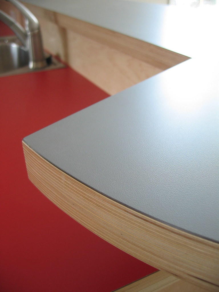
The cabinets are maple and the floors are actually white oak with a dark stain. If I remember correctly, Neil got a great deal on the floors...about $500 because they were extra from one of his flooring subs last jobs. The lower cabinets to the left and right of the middle drawers are lazy susans. That's where most of our food is stored.
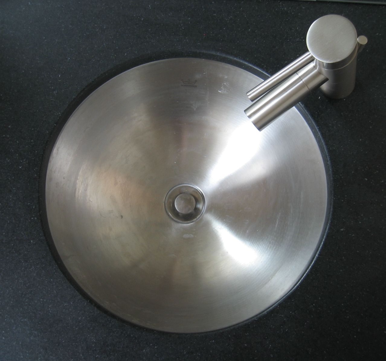
I prefer a single bowl for the kitchen sink and one big enough to keep a pot or two in for a soak. The button on the left is for the garbage disposal, which isn't getting as much use as before, since Seattle is now picking up our compostables every week.
Of course this option for the microwave only works if you are of a certain height, but it's nice not to see it exposed. The hood is from EURO-kitchen which is a great option for a low cost modern looking wall mount.
Thursday, December 10, 2009
genesee home - bathroom
Even with it's compact size, I love our bathroom. A bathroom counter doesn't have to be that deep. Ours curves out to accommodate the sink, but narrows to 12" as it hits the cabinet. Inside the cabinet we have a plug to keep the toothbrushes and electric razer out of sight. I had pulled the door up 4" off the counter so that it would clear items on the counter.
The skylight is a perfect solution to bring in light, while maintaining privacy. In the summer it also allows for natural ventilation for the apartment. Much of our material and fixture inspiration for the new house comes from what we have done in our current home. We stacked the subway tiles here and used a grey grout. The splurge here was the Grohe shower combo. The tub is Americast.
Our newest addition is the photo of F1 2009 Champion Jenson Button. Since it's taken in the rain, we thought it was appropriate in the bath.
Black Honed granite and stainless steel undermount sink and faucet - I'm partial to the one lever handle on the faucet...especially in a main bathroom.
Lewis on the Toto wondering what I'm up to.
Tuesday, December 8, 2009
our current home - the cabinet
We actually didn't have the TV before we designed the cabinet...but Neil wanted a large one. I must say, going HD at this size has been quite the viewing experience. Watching things like Planet Earth is just amazing. Living in such a small space with a TV of this size, it was critical for me to be able to hide it. When it's off, it still has a presence. So we designed a sliding door system that also hides or opens up the desk area. I don't have a picture, but there are 2 large panels back to back so both the desk and TV area can be closed off to the living room. We kept it low to allow the visual connection between the living room and bedroom so both feel larger than if there was a full height wall up to the ceiling. Under the TV, the panels open to the DVD player, cable box & audio box. To the right is miscellaneous storage.
If you look closely at the base of the TV you will notice that it is on a turn table. The TV cabinet was designed so that the TV can spin around and we can watch TV in bed. Perfect for those early 5 am Formula 1 races we watched this season. (Remember the photo in our bathroom?)
This is an earlier picture...it's good to see how much the plants have grown. This is the bedroom side. The drawers below are used for clothes and below the TV on this side hides the computer printer.
From my side of the bed, I see some of my books, then a nice long view into the kitchen and out the corner window. Long diagonal views in a small space, helps it to feel larger. This window faces East, so is the first view of daylight in the morning.
Friday, December 4, 2009
The Karina - front porch
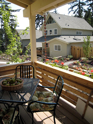
Neil continues working outside this week, completing the front porch and the back deck as well as some work on the yard. The front porch is a key design feature of the house. It's 8'x 15' which is room-size. Plenty usable instead of just a tack on. Many new homes today do not incorporate a front porch or if there is one, it's not deep enough to use. The front porch is an important transition between the public realm of the street and the private realm of the home. It's a place to sit and read the mail, to wait for friends or just watch the world go by. With our Seattle weather, it's also key to have a place to sit outside that has a roof over it. Because our house is so close to Madison Avenue, we have a lot of people walking by each day. Having the front porch is friendly gesture to the community and will provide opportunities to meet our neighbors.
Tuesday, December 1, 2009
front porch inspiration - ross chapin architects
All of these are houses in our Ross Chapin Architects' projects. It's interesting to see the different porch variations that we have done grouped together. The play of sunlight on this first one has always been a favorite of mine. Ross worked on site to get the spacing of the cross pieces just right. Sometime in the next 2 weeks, Neil will be pouring our front and back stoop that will be similar to the below...which reminds me that I have to pick up some tiles.
These next 3 are of the Highlands in Langley, on Whidbey Island.
This is the same house with 2 different porch roofs.
At some point, if the budget allows, Neil will build a tile lattice similar to this on the wrapped back porch. The recycled glass tiles are from Bedrock Industries in Seattle and we plan to use a larger 8" tile.
On this project we ended up leaving the railing natural cedar instead of painting it.
I'm ready to sit down with a gin and tonic when I look at this one. It's of a custom project that looks out on the water. I can just about feel the cool breeze. All of these porches were designed as extensions of the house. To be used not just pass through.
Subscribe to:
Posts (Atom)