Showing posts with label home. Show all posts

Tuesday, August 13, 2013

introducing CHAPUCAS

This is probably the most daunting design project I have ever worked on…the design of our own home. Having my husband and myself as clients is a lot harder than one would think. How do I get all those cool ideas I have been wanting in a house into a cohesive design and within budget? All of our decisions are based on balancing our, at times, conflicting priorities.


PRIORITIES
  • A home we will love - cool, beautiful and comfortable
  • Lots of natural light
  • Stay within our budget
  • Energy Efficient
  • Healthy, Low Maintenance & Environmentally Responsible interiors and exteriors
  • A house that fits into the neighborhood

 
DESIGN PARAMETERS
  • The lot size is 40’x120’ with alley access, 20’ front yard set back and 16’ rear yard with 5’ side yard setbacks. 
  • Open up to the southern exposure along the long side of the lot.
  • Attached ADU (accessory dwelling unit, aka mother-in-law unit)
  • Main living space on the second floor with separate bedroom
  • Connection to the outside on the second floor
  • Garage big enough for the Mini Cooper, motorcycle and all of Neil’s tools and work materials. 
  • Home offices for both of us

DESIGN CHALLENGES
  • Display my extensive book collection without overwhelming Neil’s minimalistic sensibilities.
  • A large enough home to entertain in, but small enough to be intimate for just the 2 of us.  The right size home.
  • Maintaining privacy within a city environment while bringing in lots of natural light
  • Create 2 dwelling units that are separate, but have an indoor connection

The main space is really what the whole house is designed around. I wanted lots of natural light and ventilation. A room that is both intimate and spacious. A room where the bookshelves and cabinets are built in and become the walls and the TV can be hidden with moveable panels. The house is designed around how we live and want to live.


FOR CURRENT CONSTRUCTION

 PHOTOS CLICK HERE


Friday, March 5, 2010

home office


I have a bit of commute to work (a little over an hour including a ferry crossing), but what helps is working from home 2 days a week. I am using the 3rd bedroom which is on the main floor as my office. Having a laptop helps keep it neat and portable. I need to clarify that the bookcases here were designed and made by me BEFORE I met Neil. On close inspection, they are not quite up to his standards...I've been told my carpentry skills are a bit "sketchy". Having this main floor bedroom with a full bathroom downstairs, gives one the flexibility of having one story living or using it as TV room, guest room or as I am, an office.

Thursday, December 17, 2009

genesee home

The Karina is not the first project that Neil and I have worked on together. The home we currently live in was the first and was completed in 2006...before we were married. The project was to design and construct a garage with an Accessory Dwelling Unit (ADU) above it, or "mother-in-law" apartment. This was before the now allowed Detached ADU, so it had to be "attached" to the existing 800 sqft, 1930's house. I designed it so that eventually the older house could be demolished and the garage/apartment could stand alone. Our property is skinny...only 30' wide by 100' and it's on a busy street. We actually didn't max out the current lot coverage at the time, but we came close to it. Our neighbors property is about 4' or so higher than ours, so we were not concerned with blocking sunlight. My main concern was balancing Neil's wants of a large garage (lots of tools, motorcycles, work area) and maximizing the apartment size with addressing the street and wanting to bring down the scale of the addition. The new addition would be where Neil lived and he ended up renting out the older house for a couple years...until I moved in in 2008. Now my stuff lives in the older place and our day to day living is in the 500 sqft apartment.
Both Neil and I wanted to paint the house grey. Even in our grey Seattle weather, I love this shade. It's rich, yet isn't stand-outish. I really wanted the new house to fit into our surroundings. We originally thought we would use yellow as an accent, but doing these photoshop mock-ups, we realized we wanted something more subtle.

Wednesday, December 16, 2009

genesee home - exterior details

our home
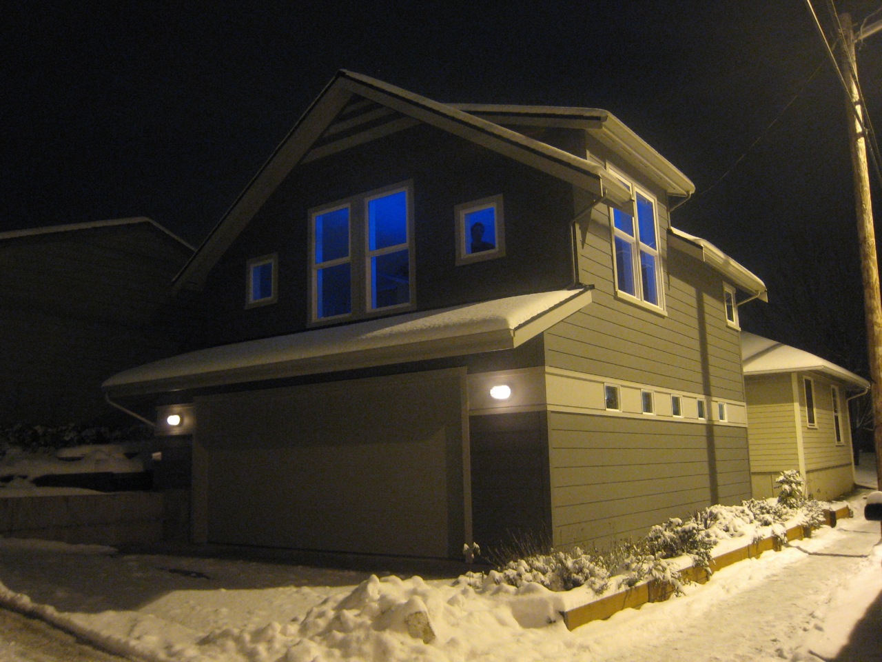
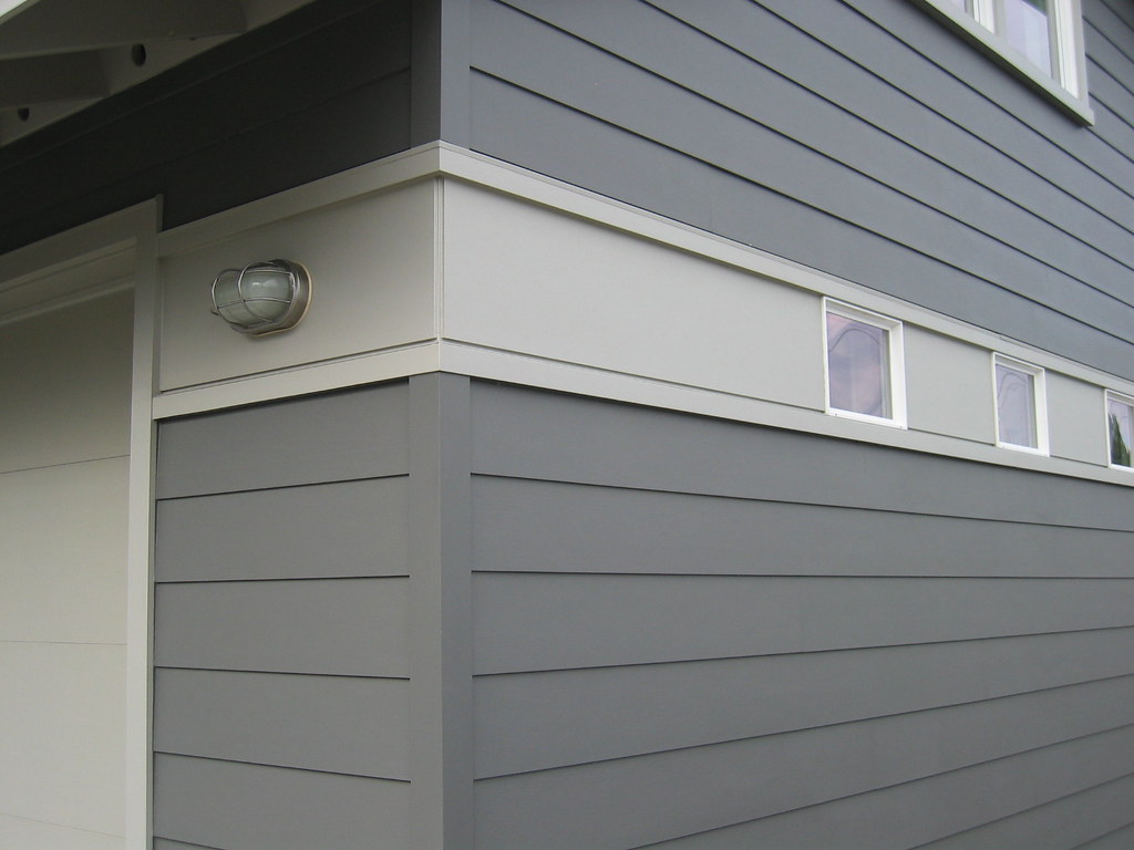
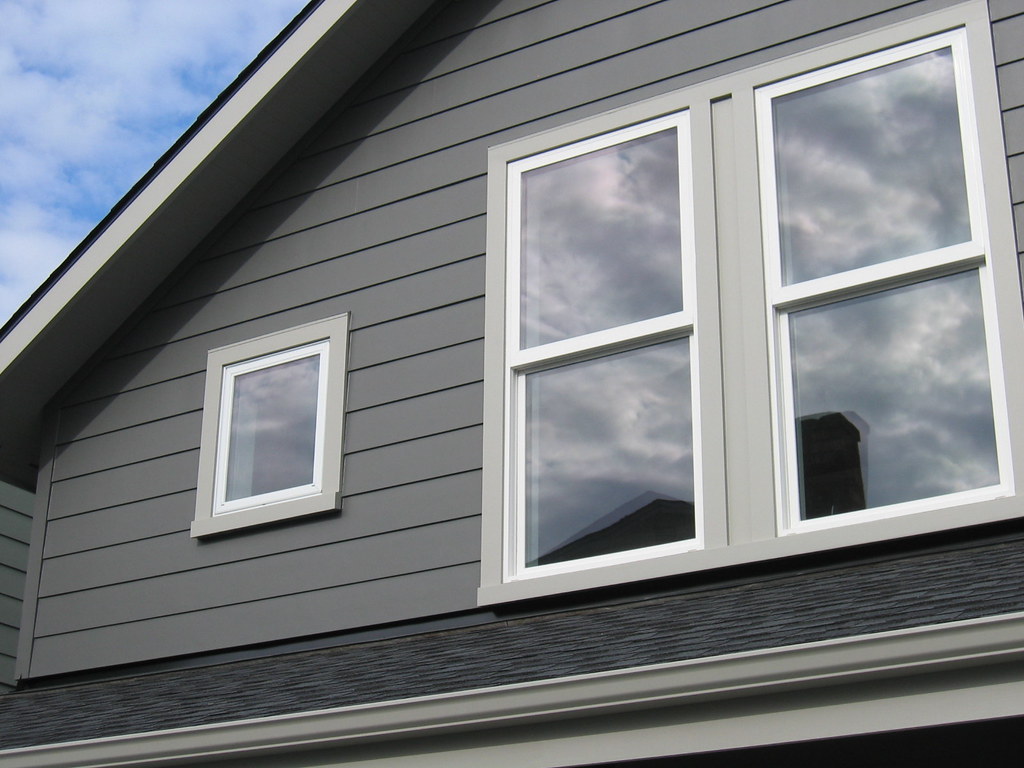
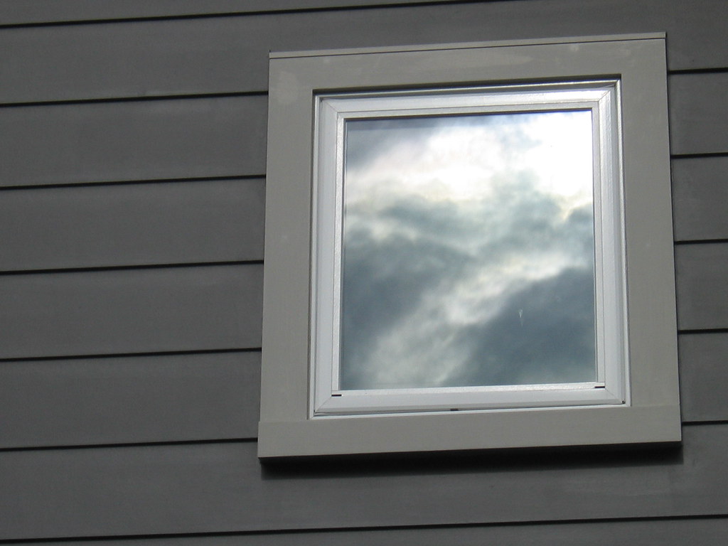
I do love how the house glows at night. The blue light is from our neon coffee table. This picture was taken last year when we had a crazy week of snow. The lower roof over the garage door helps to bring down the scale of such a tall and wide gable and actually was somewhat code driven. Where the facade of the upper story starts is also the plane of where the rear yard begins. We were not allowed to have anything over 12' in the rear yard. The band of windows on the south allows enough light to come into the garage but small enough not to be a security risk. Even though the form is classic we tried to bring in some modern detailing. Neil's Pad - 04 The window trim is 2x4 picture framed with a 4x4 window sill. We wanted the windows to pop and have a heavy shadow line.Neil's Pad - 02 

Neil's Pad - 03

Tuesday, December 15, 2009

our current home - exterior details

The siding is HardiPlank and we used an 8" exposure. I also think this helps to bring the scale down, plus I just like the large exposure...I would have actually preferred more like 10" or 12", but this works. At the top of the gable end we alternated 2x material with the siding and then painted it the lighter grey. This helped to give it some character and balance. Without it, the gable felt too high and looked like it needed something. We originally thought of cross ties or brackets, but wanted a more modern look. The reason why we didn't just have higher windows, was we used scissor trusses on the inside and the windows are proportional to the inside.
Eventually when the older house is removed, I envisioned an entry porch further back off the sidewalk, but for now, we enter in the garage. Our friend Andy did all the metal work throughout the house including the roof overhang here.


Because we have a bus stop right out this door, our stoop gets quite a bit of use. You'd think we would be able to keep up with such a small garden (3'x30'), but this summer we really neglected it due to the new house...luckily many of the plants are drought tolerant. Next spring I'll fill in with more lavender, which is pretty hardy.

Saturday, December 12, 2009

genesee home - inside


So inside we go...the apartment is about 544 sqft including the stairs up. It's basically a square open plan. There are many aspects that I love about our home, but if I had to pick my favorite, it would be the light. We have windows on all 4 sides with the largest facing South and West. Sitting on our couch, I can look out the window and feel the sun on my face as I read a book or browse on my laptop. The cats also like it up here. Neil created a passageway into the adjoining house and even though all my books, most of my clothes and other items are there, I would say 95% of our time is in the light filled apartment.
The neon coffee table was made by our good friend Marc Lawrence. I commissioned it for Neil a few Christmas' ago, specifically for here. The orange cubes were ordered from Crate & Barrel and are favored by Chessie. The couch pillows were made by me and the rug is FLOR tiles. The orange side table the plant sits on, Neil also made years ago. There is a matching one in the bedroom.

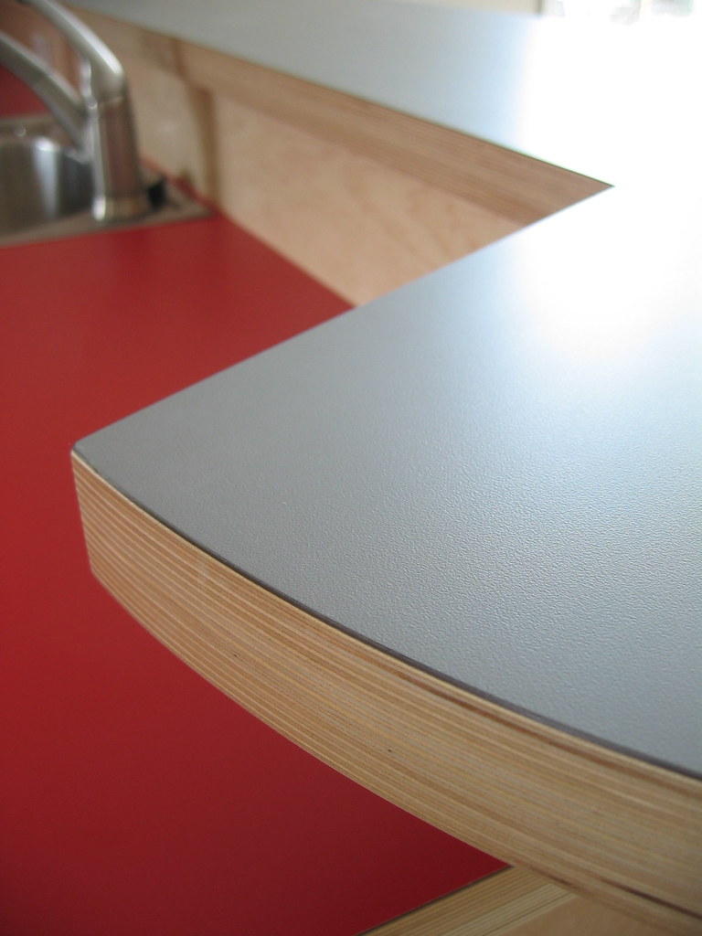
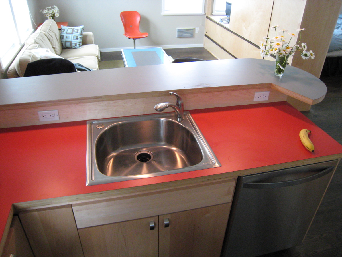
The center cabinet was also built by Neil. We designed it as a multiple use divider between the living room and bedroom. The kitchen counters are laminate with a 1.5" thick birch plywood edge. I've always liked this detail and Neil did such a beautiful job on the raised counter.
Neil's Pad - 09
The cabinets are maple and the floors are actually white oak with a dark stain. If I remember correctly, Neil got a great deal on the floors...about $500 because they were extra from one of his flooring subs last jobs. The lower cabinets to the left and right of the middle drawers are lazy susans. That's where most of our food is stored.

I prefer a single bowl for the kitchen sink and one big enough to keep a pot or two in for a soak. The button on the left is for the garbage disposal, which isn't getting as much use as before, since Seattle is now picking up our compostables every week.
Neil's place - 4.jpg
Of course this option for the microwave only works if you are of a certain height, but it's nice not to see it exposed. The hood is from EURO-kitchen which is a great option for a low cost modern looking wall mount.

Tuesday, December 8, 2009

our current home - the cabinet


We actually didn't have the TV before we designed the cabinet...but Neil wanted a large one. I must say, going HD at this size has been quite the viewing experience. Watching things like Planet Earth is just amazing. Living in such a small space with a TV of this size, it was critical for me to be able to hide it. When it's off, it still has a presence. So we designed a sliding door system that also hides or opens up the desk area. I don't have a picture, but there are 2 large panels back to back so both the desk and TV area can be closed off to the living room. We kept it low to allow the visual connection between the living room and bedroom so both feel larger than if there was a full height wall up to the ceiling. Under the TV, the panels open to the DVD player, cable box & audio box. To the right is miscellaneous storage.

If you look closely at the base of the TV you will notice that it is on a turn table. The TV cabinet was designed so that the TV can spin around and we can watch TV in bed. Perfect for those early 5 am Formula 1 races we watched this season. (Remember the photo in our bathroom?)

This is an earlier picture...it's good to see how much the plants have grown. This is the bedroom side. The drawers below are used for clothes and below the TV on this side hides the computer printer.
Home 09'1214 - 3From my side of the bed, I see some of my books, then a nice long view into the kitchen and out the corner window. Long diagonal views in a small space, helps it to feel larger. This window faces East, so is the first view of daylight in the morning.

Friday, October 30, 2009

our home


This is our living room. I was thinking I'll do a bunch of posts next week about our current home and how it was created. It has evolved since Neil and I were first dating 7 years ago. This picture was taken last week after a party we had...that's why it is as tidy as it is. Typically the coffee table/light table is filled with remotes, my magazines and work related stuff.